Dev Journal #15 - App Architecture Part 2
androidIn the previous post Dev Journal #14 - App Architecture Part 1, we built a repository that overviews both the local database and the web service API to provide a single source of truth to the UI layer.
In this post, we will consume the data that we retrieved from this repository to present them as View objects on the screen. We will also follow reactive programming paradigm to continuously observe these view objects for any changes and update the UI accordingly.
Layouts
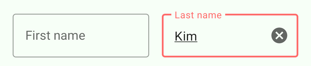
The XML layout defines how each View or ViewGroup object should look and where it should be positioned on the screen. A View object is typically a widget like a Button or a TextView that the user can interact with. Whereas a ViewGroup is a container that defines the layout structure for more View and ViewGroup objects. Here are some sample screenshots of the Edit Profile screen from the app.
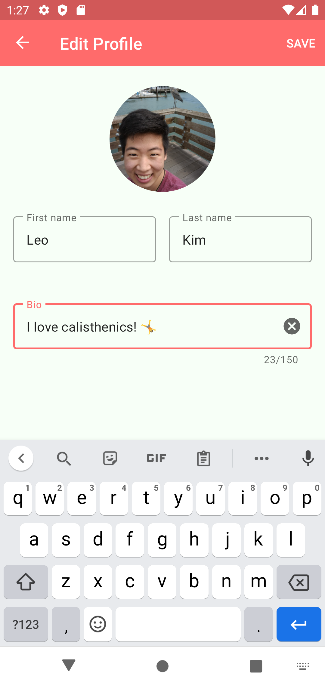
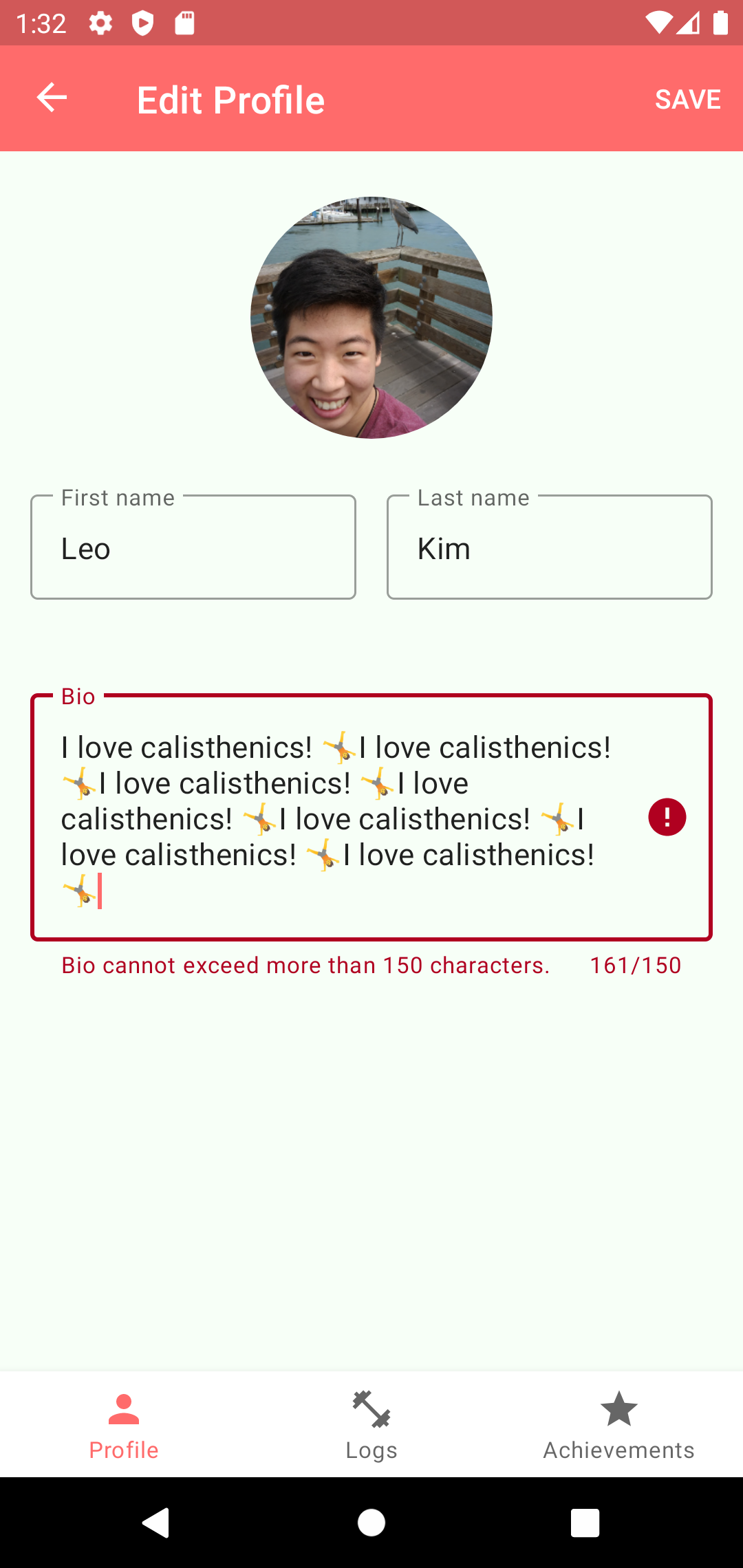
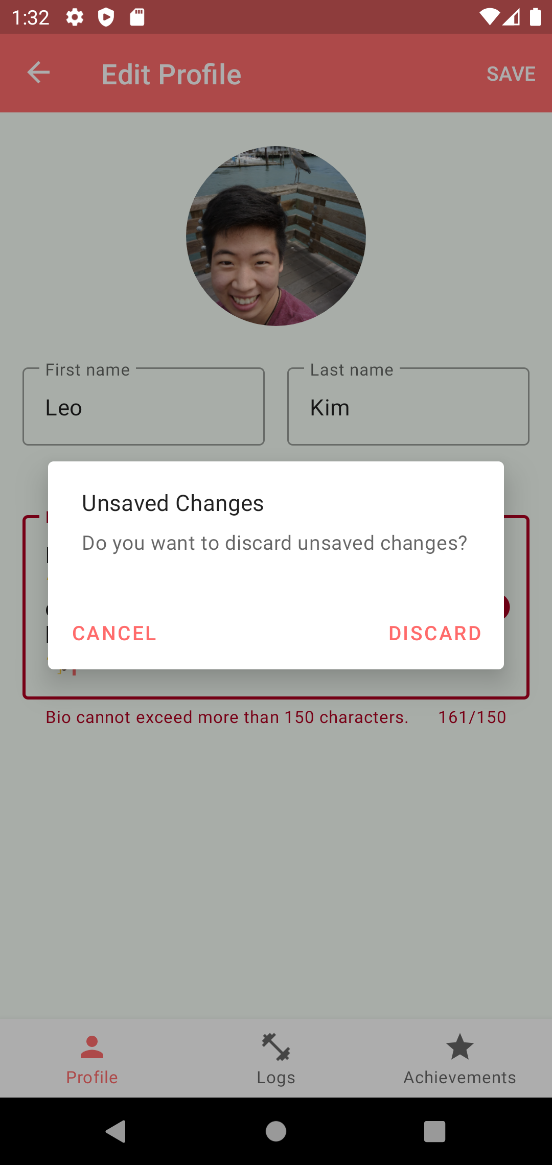
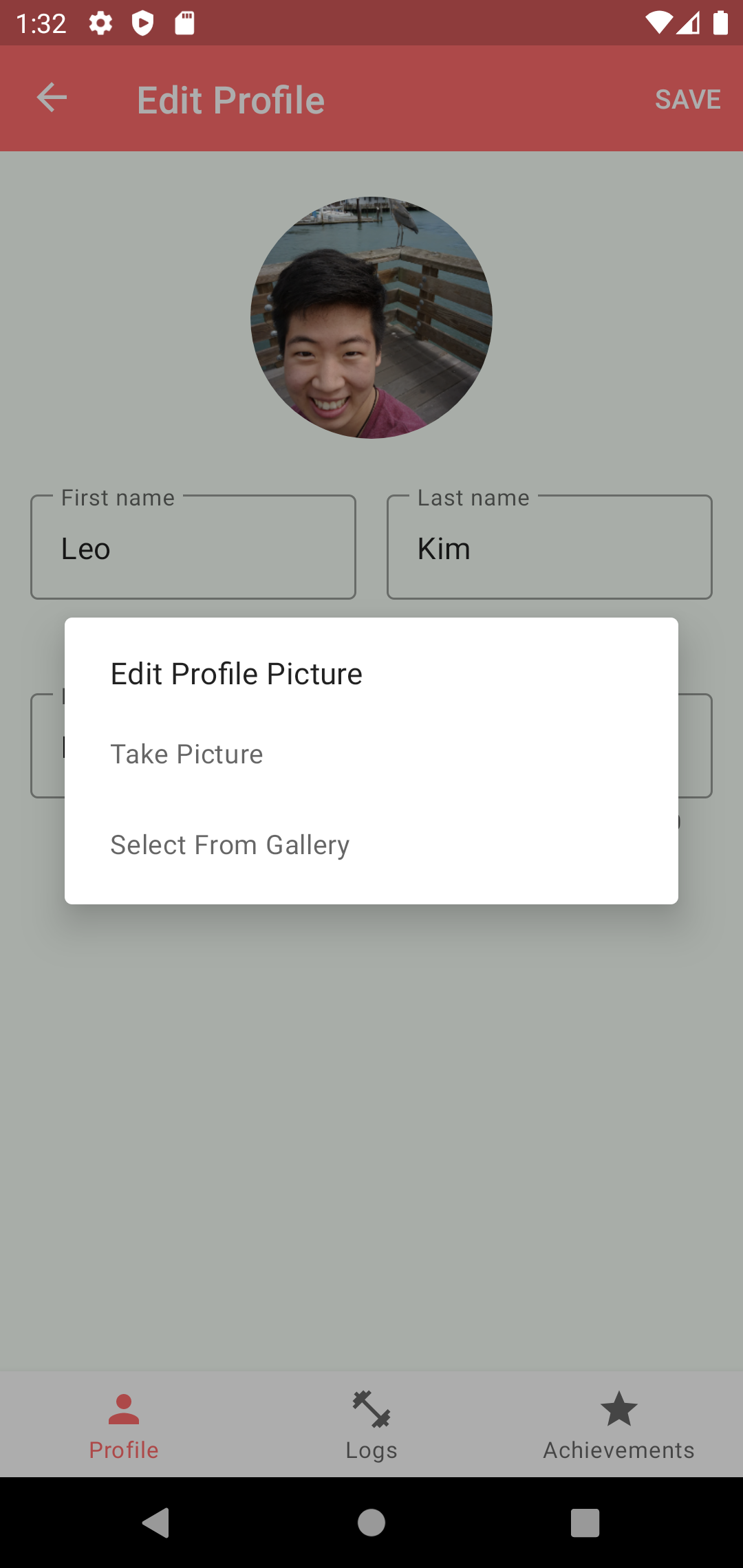
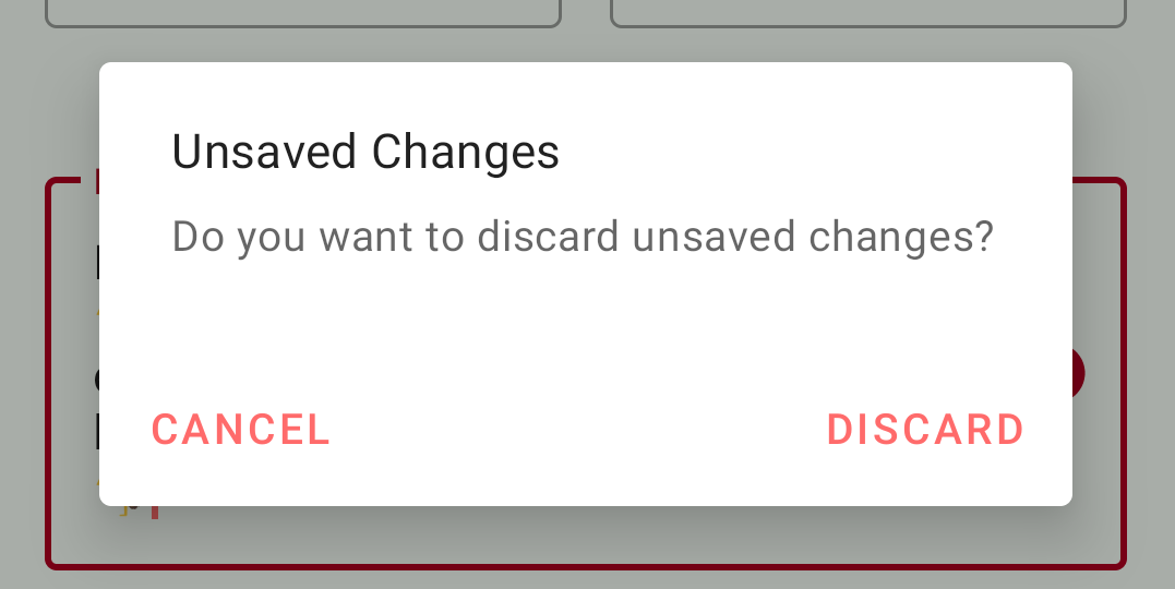
Going over the visual components, there is a toolbar at the top with a back navigation button to the left and a save button to the right. On the main screen, you will find an ImageView for the user profile picture, and multiple EditText widgets for basic user info. There is also an alert dialog (a popup message with positive, neutral, or negative dismissal options) and a simple dialog (a popup with a list of actionable items that can be selected) that can be triggered from certain user actions such as tapping on the back navigation button before saving. Finally, there is the bottom navigation at the foot of the screen.
<?xml version="1.0" encoding="utf-8"?>
<layout xmlns:android="http://schemas.android.com/apk/res/android"
    xmlns:app="http://schemas.android.com/apk/res-auto">

    <data>
        <variable
            name="editProfileViewModel"
            type="com.leoybkim.findingfitness.modules.editprofile.EditProfileViewModel" />
    </data>

    <androidx.constraintlayout.widget.ConstraintLayout
        android:layout_width="match_parent"
        android:layout_height="match_parent">

        <com.google.android.material.appbar.MaterialToolbar
            android:id="@+id/toolbar"
            android:layout_width="match_parent"
            android:layout_height="wrap_content"
            android:background="?colorPrimary"
            android:theme="@style/ToolbarTheme"
            app:layout_constraintEnd_toEndOf="parent"
            app:layout_constraintStart_toStartOf="parent"
            app:layout_constraintTop_toTopOf="parent" />

        <ImageView
            android:id="@+id/edit_profile_image"
            android:layout_width="128dp"
            android:layout_height="128dp"
            android:layout_gravity="center"
            android:layout_marginTop="24dp"
            android:contentDescription="@string/profile_image"
            android:onClick="@{() -> editProfileViewModel.onClickProfilePicture()}"
            app:imageUrl="@{editProfileViewModel.imageUrl}"
            app:layout_constraintEnd_toEndOf="parent"
            app:layout_constraintStart_toStartOf="parent"
            app:layout_constraintTop_toBottomOf="@+id/toolbar" />

        <!-- Omitted for brevity ... -->

    </androidx.constraintlayout.widget.ConstraintLayout>
</layout>
Material Design
The stock widgets from the default Android library are quite solid and customizable. But if you are looking for a third-party library that can provide rich features with enhanced usability right out of the box, Material Design might be for you.
You need the following line in the app level Gradle file to import the library into the project.
implementation "com.google.android.material:material:1.3.0"
Text fields
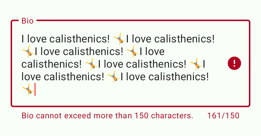
Material Design library can provide many helpful features that extend the EditText widget. For instance, with the TextInputLayout, you can style the outline of the input box or indicate activation on focus. You can also display a floating label, helper texts, error messages, character counter, a trailing icon and more.
<com.google.android.material.textfield.TextInputLayout
    android:id="@+id/edit_first_name_input_layout"
    style="@style/Widget.MaterialComponents.TextInputLayout.OutlinedBox"
    android:layout_width="0dp"
    android:layout_height="wrap_content"
    android:layout_marginStart="16dp"
    android:layout_marginTop="24dp"
    android:layout_marginEnd="8dp"
    app:errorEnabled="true"
    app:layout_constraintEnd_toStartOf="@+id/edit_last_name_input_layout"
    app:layout_constraintHorizontal_bias="0.5"
    app:layout_constraintHorizontal_chainStyle="spread"
    app:layout_constraintStart_toStartOf="parent"
    app:layout_constraintTop_toBottomOf="@+id/edit_profile_image">

    <com.google.android.material.textfield.TextInputEditText
        android:id="@+id/edit_first_name"
        android:layout_width="match_parent"
        android:layout_height="wrap_content"
        android:hint="@string/first_name"
        android:maxLines="1"
        android:text="@={editProfileViewModel.firstName}" />
</com.google.android.material.textfield.TextInputLayout>
Dialogs
A dialog is a small modal window that informs the user about critical information or prompts them to make a decision. The window is displayed above all other views to bring attention to itself. Anything behind the dialog is scrimmed to express that the rest of the app is inaccessible until an action is taken. For simple prompts with a single input, you can use the basic AlertDialog.Builder. MaterialAlertDialog.Builder is an extension of AlertDialog.Builder for use with a Material theme. The type of dialog returned is still an AlertDialog; there is no specific Material implementation of AlertDialog.
You can also greatly customize your dialog design by extending DialogFramgent and creating an AlertDialog in the onCreateDialog() callback method.
App bar
MaterialToolbar extends androidx.appcompat.widget.Toolbar and implements certain Material features like elevation overlays or shape theming.

Bottom Navigation
The bottom navigation bar is an extension of FrameLayout that makes it easy for users to swap between top-level views. It is best used with three to five top-level destinations. Check out Dev Journal #12 - AndroidX Navigation for implementation details.

Activity and Fragment
An Activity is a single, focused thing that the user can do. The activity class provides a window where you can place your layout. Typically, one activity in an app is specified as the main activity which acts as the entry point of the app. Each activity can then subsequently launch another activity through intents.
A Fragment is a piece of UI or behaviour that can be placed in an activity. At its core, it represents a particular operation or an interface that is running within an activity and it can not be used apart from one. Like an activity, a fragment instance has its own lifecycle. However, that lifecycle is dependent on its parent activity. If the activity is stopped, no fragments inside of it can be started; when the activity is destroyed, all fragments will be destroyed.
As explained in the previous post Dev Journal #12 - AndroidX Navigation, I’m following the single activity architecture in this app. The NavHostFragment is attached to the main activity upon launch using the FragmentManager. This manager is also responsible for transitioning the fragments through their lifecycle and determining their current state. The main activity solely acts as a container for the fragments. All user interactions are handled through the attached fragment and the ViewModel bound to it.
class EditProfileFragment : Fragment() {
    private var _binding: FragmentEditProfileBinding? = null
    private val binding get() = _binding!!
    private lateinit var editProfileViewModel: EditProfileViewModel
    private lateinit var navController: NavController

    override fun onCreateView(
        inflater: LayoutInflater,
        container: ViewGroup?,
        savedInstanceState: Bundle?
    ): View {

        _binding = DataBindingUtil.inflate(
            inflater,
            R.layout.fragment_edit_profile,
            container,
            false
        )
        navController = this.findNavController()

        editProfileViewModel =
            ViewModelProvider(this, viewModelFactory).get(EditProfileViewModel::class.java)

        binding.editProfileViewModel = editProfileViewModel
        binding.lifecycleOwner = viewLifecycleOwner

        // ...

        return binding.root
    }

    override fun onViewCreated(view: View, savedInstanceState: Bundle?) {
        super.onViewCreated(view, savedInstanceState)
        binding.toolbar.inflateMenu(R.menu.toolbar_edit_profile)
        binding.toolbar.setupWithNavController(navController)
        binding.toolbar.setNavigationOnClickListener {
            requireActivity().onBackPressed()
        }
        binding.toolbar.setOnMenuItemClickListener {
            when (it.itemId) {
                R.id.action_save -> {
                    editProfileViewModel.saveUserProfile()
                    super.onOptionsItemSelected(it)
                }
                else -> false
            }
        }
    }

    override fun onDestroyView() {
        super.onDestroyView()
        _binding = null
    }
}
The layout is inflated during the lifecycle stage called onCreateView(). Then the next stage onViewCreated() runs immediately after to set up additional logic such as the click listeners where it references the views created from the previous stage. Because the fragment outlives their views, you should clean up any references to the binding class instance during the onDestroyView() stage to avoid memory leaks.
ViewModel
ViewModel class is responsible for providing and managing the data for an activity or a fragment. The ViewModel instance is created within the scope of a fragment or an activity and will be retained as long as the scope is alive. Using the reactivity of the LiveData or Data Binding, the fragment or the activity can observe changes made to the data states exposed by the ViewModel. Following the separation of concern architectural principle, the ViewModel’s only job is to manage the data for the UI. It must never reference a view or hold a reference back to the scope.
class EditProfileViewModel(
    private val repository: UserProfileRepository,
    application: Application
) : AndroidViewModel(application) {

    // ...

    private val _unauthorized = MutableLiveData<Boolean>()
    val unauthorized: LiveData<Boolean>
        get() = _unauthorized

    private val _loading = MutableLiveData<Boolean>()
    val loading: LiveData<Boolean>
        get() = _loading

    private val _errorMessage = MutableLiveData<String?>()
    val errorMessage: LiveData<String?>
        get() = _errorMessage

    private val _username = MutableLiveData<String>()
    val firstName = MutableLiveData<String?>()
    val lastName = MutableLiveData<String?>()
    val bio = MutableLiveData<String?>()

    init {
        _loading.value = true
        _username.value = repository.getAuthUsername()

        viewModelScope.launch {
            _username.value?.let {
                repository.getCurrentUserProfile(it, false)
                    .collect { response ->
                        _loading.value = false
                        when (response.status) {
                            APIStatus.SUCCESS -> {
                                response.data?.let { data -> updateUserProfile(data) }
                            }
                            APIStatus.UNAUTHORIZED -> {
                                _unauthorized.value = true
                            }
                            APIStatus.ERROR -> {
                                _errorMessage.value = response.message
                            }
                            APIStatus.LOADING -> {
                                _loading.value = true
                            }
                        }
                    }
            }
        }
    }

    private fun updateUserProfile(currentUserProfileResult: UserProfile) {
        firstName.value = currentUserProfileResult.firstName
        lastName.value = currentUserProfileResult.lastName
        bio.value = currentUserProfileResult.bio
        _imageUrl.value = currentUserProfileResult.image
    }

    // ...
}
The current user’s profile data is fetched from the repository at the initialization of the EditProfileViewModel class. The fetch calls are coroutines so they should be invoked from the viewModelScope which is the coroutine scope that is tied to the ViewModel. As the fetch call is fired, the loading data state is set to true so that it can be used to inform the user about an ongoing action. Once the data is fetched, data states are once again updated to reflect the response returned from the repository. Since each data states are of LiveData type, all changes to the states are notified to the Observer objects in the fragment class. For example, the visibility of the spinner widget can be updated by the fragment when the data state of loading is updated.
editProfileViewModel.loading.observe(viewLifecycleOwner, { loading ->
    binding.spinner.visibility = if (loading) View.VISIBLE else View.GONE
})
ViewModelProvider.Factory
The ViewModelProvider.Factory class instantiates and returns the ViewModel objects that can survive configuration changes. The ViewModelProvider will create ViewModels via the given factory and retain them in a store of the given ViewModelStoreOwner. The created ViewModel is associated with the given scope and will be retained as long as the scope is alive. Additionally, the factory-method design pattern allows us to pass arguments to the constructor of the ViewModel object.
class EditProfileViewModelFactory(
    private val repository: UserProfileRepository,
    private val application: Application
) : ViewModelProvider.Factory {
    @Suppress("unchecked_cast")
    override fun <T : ViewModel?> create(modelClass: Class<T>): T {
        if (modelClass.isAssignableFrom(EditProfileViewModel::class.java)) {
            return EditProfileViewModel(repository, application) as T
        }
        throw IllegalArgumentException("Unknown ViewModel class")
    }
}
Data Binding
The Data Binding Library allows you to bind UI components directly from the layout file to the data objects in the ViewModel class. Without data binding, the view components are typically assigned programmatically to the data sources using findViewById() like this:
view?.findViewById<TextInputEditText>(R.id.edit_first_name)?.apply {
    setText(editProfileViewModel.firstName.value)
}
However, with the data binding library which automatically generates the classes required to bind the view in the layout with the data objects, you can directly declare the link between the UI component and the data source like this:
<com.google.android.material.textfield.TextInputEditText
    android:id="@+id/edit_first_name"
    android:layout_width="match_parent"
    android:layout_height="wrap_content"
    android:hint="@string/first_name"
    android:maxLines="1"
    android:text="@={editProfileViewModel.firstName}" />
Note that the syntax @{} is used for one-way data binding, and @={} notation is used for two-way data binding. Two-way binding can receive the data changes to the property and listen to user updates at the same time. So one-way binding is sufficient for read-only view objects whereas, two-way binding is useful for editable inputs.
The binding variables that are used in expression should be defined inside the data tag that sits on the same hierarchy as the layout’s root element like shown in the following:
<?xml version="1.0" encoding="utf-8"?>
<layout xmlns:android="http://schemas.android.com/apk/res/android"
    xmlns:app="http://schemas.android.com/apk/res-auto">

    <data>
        <variable
            name="editProfileViewModel"
            type="com.leoybkim.findingfitness.modules.editprofile.EditProfileViewModel" />
    </data>

    <androidx.constraintlayout.widget.ConstraintLayout ... />
</layout>
Conclusion
This post concludes the two-part series of the MVVM app architecture for Android programming. Part 1 of the series covered the “Model” of the architecture where we implemented the repository that provides the single source of truth amongst the web service and the local data storage. In this post, we focused on the “View-ViewModel” of the architecture where the data provided from the repository can be properly consumed and updated by the UI components. I’ll be writing up another short blog post on dependency injection. Using the Hilt and Dagger library can significantly reduce the boilerplate code which I think can be a double-edged sword for Android beginners. On one hand, it reduces the redundancy and improves ease of testing but on the other hand, the complexity of the abstraction makes it difficult to grasp what’s going on under the hood. This is why I decided to go over the old-fashioned way first before refactoring it with dependency injection for my own sake of understanding. Overall, the whole write-up process has been a great decision. It feels like I have completed a very thorough code review 👍